When a study is open in the Sequence Planner Module, the main window looks something like the screenshot below. There are two sections: the chart and the sheet view. Since the chart is based on the sheet view, sheet view will be discussed first.

Sequence Study
Sheet View
To expand the sheet view, hide the chart with the collapse button ![]() at the top right of the chart view. The sheet view will expand to fill the space.
at the top right of the chart view. The sheet view will expand to fill the space.
Station Utilization and Display Value Options
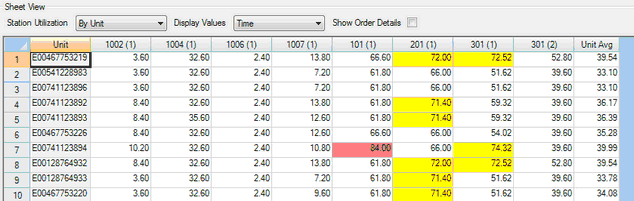
The Station Utilization can be measured in time segments (By Time of Day), as shown above, or by unit names (By Unit). You can select their preference from the drop-down menu. Also if you are on the "By Time of Day" table and want to switch to "By Unit" you can right click and select "View Selected Unit"
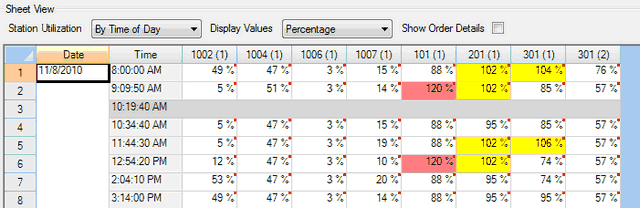
The values in the spreadsheet can be displayed by the length of Time required at each station or as a Percentage of Takt time. In the screenshot shown above, the cells show how many minutes are required at each station. The time units can be set or changed with the Options tool.
Changes made to Station Utilization and Display Value will be reflected in the chart.
Alerts (Colored Cells)
Cells in the sheet that are yellow or red indicate that the work at that station exceeds a user-specified percentage of Takt time. Yellow cells are a warning flag, and red cells are an alarm. You can set the desired levels in Tools > Preferences > Sequencing. In the screenshots in this section, the warning level is set at 100% of Takt, and the alarm is set at 110% of Takt.
This view shows By Unit station utilization with Time as the display value.
This view shows station utilization By Time of Day and displays the values as percentages.
Double Click Functions
Double clicking on a cell in the sheet view will display a list of the tasks and parts for that cell's unit configuration. You can also right click and select "View Tasks/Parts"

Displayed List of Tasks and Parts
Double clicking on a unit serial number in the sheet view will bring up the model and options codes for that unit. You can also right click and select "View Unit Details"

Unit Model and Option Codes
Chart
The chart section provides a visual indicator of how each station is meeting Takt time. The chart is generated based on the information displayed in the sheet view.
Possible Chart Views
The chart can have four different configurations or can be hidden to allow for a larger sheet view. To hide the chart, use the collapse button ![]() at the top right of the chart view. The sheet view will expand to fill the space.
at the top right of the chart view. The sheet view will expand to fill the space.
There are two main modes for the chart: By Time of Day or By Unit. You can switch from one to the other by changing the Station Utilization selection in the sheet view.
The x-axis of the chart always displays stations. The y-axis value changes depending on the Display Value selection in the sheet view. Possible y-axis values are time and percentage.
By Time Of Day Chart View

Time Of Day View
Time Selection
Sequence Planner breaks all of the time in the study down into increments with the length of the specified Takt time. Each of these increments is displayed in the "Time" drop-down menu. In the situation above, the third time-segment of the day is selected. The study begins at 8:00 AM, and Takt time is 3.5 minutes. You can also select a time of day by clicking on a row in the sheet view.
Chart colors
The bars on the by-time-of-day graph are color-coded so you can easily picture how the segment relates to the currently selected time:
•Blue indicates a time segment that occurred before the selected time.
•Red indicates the currently selected time segment.
•Green indicates a time segment that occurs after the selected time.
•If there is a break or no production for some other reason, no bar will appear.
Cycles Before, Cycles After and hover
Sequence Planner allows you to specify how many cycles before and after the current time segment are displayed.
Any of the individual values on the graph will be displayed if you hover over the bar with your mouse. For example, the 201(1) is hovered over, making the rest of the stations transparent; this indicates that the mouse is hovering. The value for the bar appears to the right in the text box. It has a value of 71.4 seconds.

Hover Tool
By Unit Chart View
The By Unit chart view displays a station-by-station view of the work that goes into building selected units. In this mode, you can select the unit or units you wish to see from the sheet view, and the information is displayed in the graph.
To select a unit, click on the row in the sheet view. To select multiple consecutive rows, click and drag from the first unit name to the last unit name OR click the first desired unit, hold shift, and select the last desired unit. Currently, only rows that are next to each other can be selected. Rows in the sheet view can be rearranged by clicking on the row number and dragging. You can also move rows up and down by right clicking on them.

Unit Chart View
To select multiple consecutive rows, click and drag from the first unit name to the last unit name OR click the first desired unit, hold shift, and select the last desired unit. Currently, only rows that are next to each other can be selected. Rows in the sheet view can be rearranged by clicking on the row number and dragging.

Selecting Rows